Key Insights - From this Assignment:
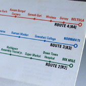
Students changed the timetable from rows and columns to a graphical representation, this drastically improved comprehension as it converted coded information in rows of columns with abbreviated references to directly placed names on the graphical map.
Graphical translation of the map allowed for distances to be comprehended visually. This is comparable to viewing time in an analog clock versus digital clock. An analog clock allows one to process the current time as well as the time left to perform a certain activity. This could be compared to providing additional information. Information is better understood when it is placed in the context of past (places usually visited and bus routes taken for the same), present (current location) and future (desired destination) state of the user in any given scenario.
In the redesigned bus timetable, while scanning a visual map one is able to grasp things through visuospatial distances. In the earlier version of the timetable; the information was largely ‘hidden’ as it was presented in alpha-numerals distributed across rows and columns, which had to be searched in vertical and horizontal directions each time the timetable, had to be used. Breaking out of rows and columns and utilizing a graphical map did helped convert, what was earlier mere data into user-friendly information. Now the bus timetable user can not only find a bus most suited to his/ her schedule, but also know how far off or nearby her destination is and what other bus routes pass through the said neighborhood. This information is empowering as it reduces the learning curve involved with the timetable usage and helps clarify the conceptual model at a faster pace.


