

+
-
Tool Facet
+
-
Hand Facet
+
-
Proportion Facet
Over the years we have realised that the existing formal literature on the anatomy of Devanagari letters is limited. Type designers have afforded only a page or two, to the description of the Devanagari letters in discourse/theory. There are a number of differences in the nomenclature used by designers to describe the specific parts (stroke elements) within letters and there exists no universal consensus on the reference lines for Devanagari letters though there are loose similarities on the basic lines; they quickly disappear when much more detailed concepts are applied.
We developed a conceptual model for Devanagari typefaces by consolidating concepts from earlier literature, designers and end users. The model was strengthened by introducing newer concepts which were not articulated by the earlier sources. In our thesis we suggest that this model can visually describe any given Devanagari typeface and it is this model which has been used as a base for developing the tool. The facets of the model are described in the terminology section so that students and designers can refer to these while searching/researching Devanagari fonts.
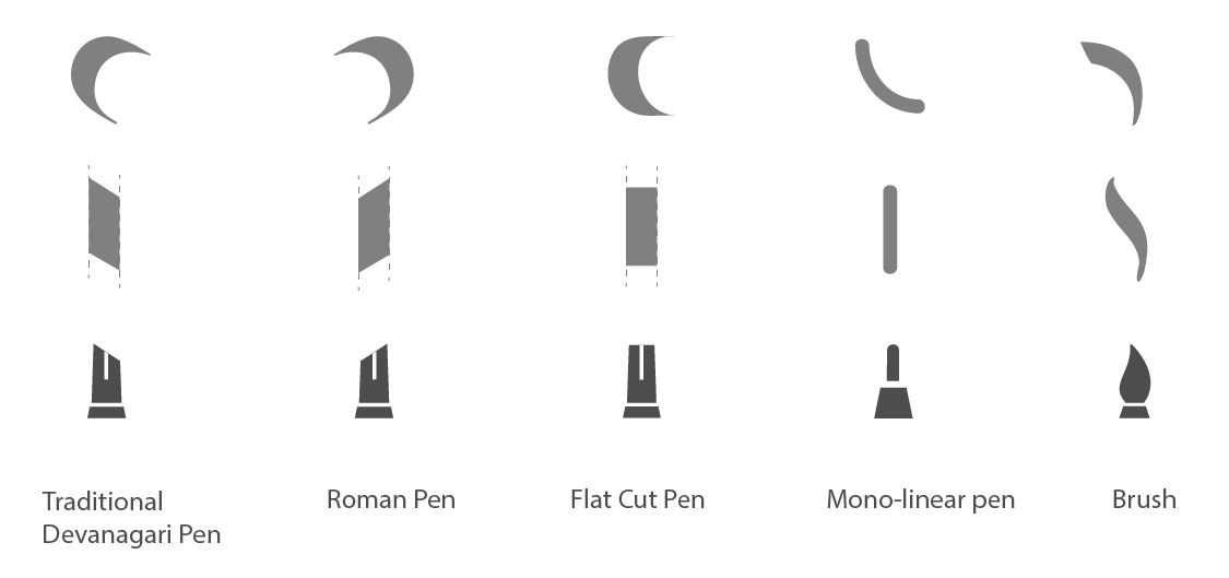
The Tool (कलम, साधन, उपकरण) is used to draw the letter in the given typeface. Choosing the tool is the first activity that a type designer does. The strokes of the typeface, terminals, contrast etc. are determined by the tool used. Examples of commonly used tools are: the Devanagari Pen (बोरू), Roman Pen, Monolinear Pen, Brush etc. The tool is the primary parameter for classification for many type designers. As of date, a majority of typefaces use only a single tool to draw its letters; but multiple tools can be used to draw them.
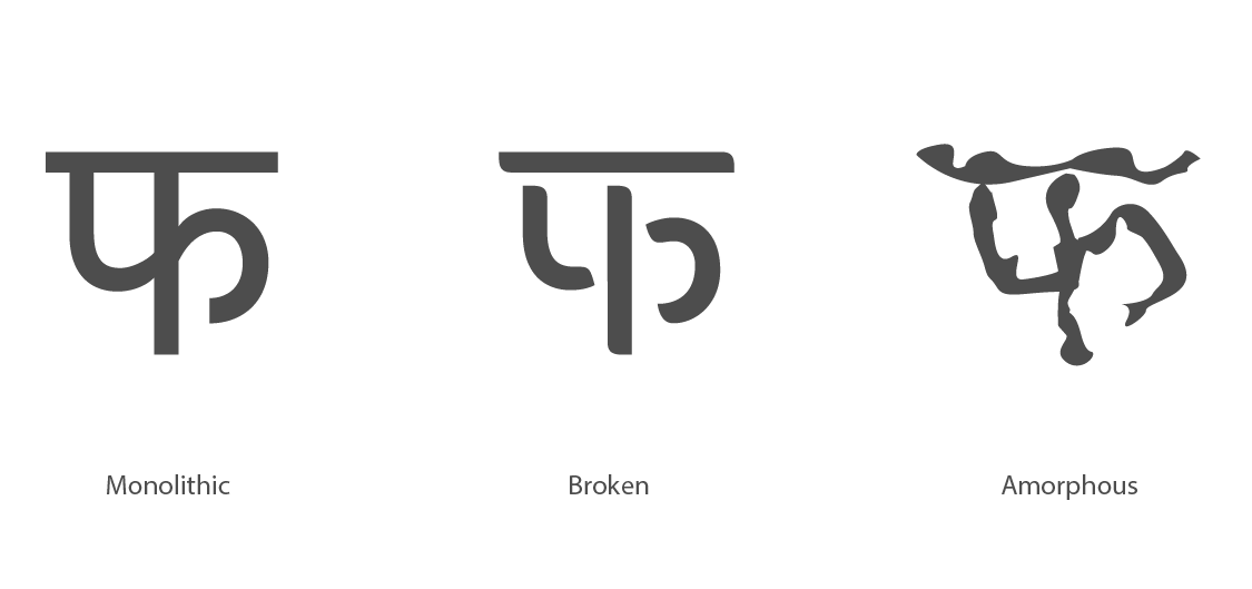
The Construction (मांस, गठन) is the appearance of the exterior boundaries of the stroke in a given typeface. As of date most of the existing typefaces have a solid/monolithic build (अखंड); although there are a few typefaces which have broken or interrupted (खंडित) flesh. Typefaces like Stencil and dotted belong to interrupted styles.
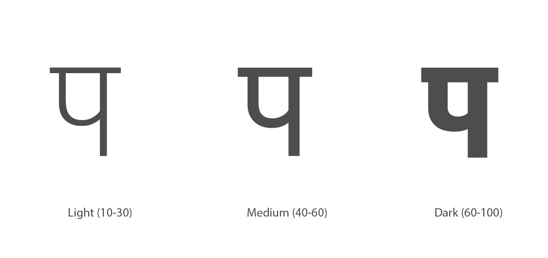
The Gray Value (काला मूल्य, वजन) can be said to be the overall darkness of letters as perceived by typographers. Mathematically, it is defined as the darkness of the selected letter for a standardised area and size as represented by number. The name/nomenclature of the weight is generally decided by the type designer or type foundry, and is usually associated with a name within the family. The grey value can be said to be the overall darkness of letters as perceived by typographers. A typical typeface might contain Light, Normal, Semibold, Bold, Black and Extra Black variations; these can be perceived as Light, Medium and Dark. If judged as Light, Medium, Bold, Black etc. the distribution is discrete; if measured mathematically—by a numerical such as 200, 500, 800 etc. the distribution is continuous.
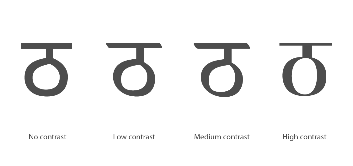
Contrast (विषमता), The contrast is the difference between the thickest parts of the stroke as against its thinnest. Contrast is identified by examining the stroke in curvilinear letterforms. In most cases, it depends on the tool used. For example, a monolinear pen will produce a stroke with no contrast; whereas canted pens produce medium to high contrast. Monoliner fonts also often happen to have differences in stroke width, though this contrast between the strokes is not meant to be perceived while reading.
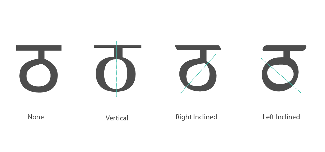
The Axis or Stress (अक्षरेखा, बलाघात, ताण) is the angle at which the thinnest parts of the stroke are located or the direction in which a curved stroke changes weight. The axis can be easily judged by examining curvilinear letters such as ठ. The direction of the axis can be measured as None, Vertical, Horizontal, Left Inclined and Right Inclined. Traditional tools such as the Devanagari Reed pen produce a Right Inclined Axis (दाएँ झुका अक्ष); the roman calligraphic pen, and the Arabic Calligraphic pen on the other hand produce a Left Inclined Axis (बाएं झुका अक्ष) while a Flat pen produces a vertical axis (ऊर्ध्वाधर, खड़ा, उभा अक्ष).
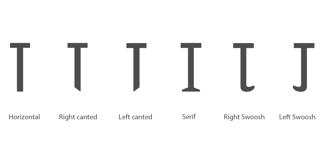
The Vertical Terminal (खडी, उभी रेखान्त) is the nature in which the vertical terminal of the font terminates. Traditional Devanagari text fonts have Right Canted Terminals, and at times a 'Swoosh', 'Tick' or a 'Flick' which can either go towards the left or the right of the vertical. Typefaces drawn with the roman calligraphic pen, if left untreated, have Left Canted Terminals. Monolinear fonts have a Horizontal Terminal, which can be treated to create a Slab Serif. Rounded monolinear tip pens produce Rounded Terminals or Rounded Serifs. The ends of the tilted terminals are not always pointed, in some cases they can be flattened early so as to blunt the sharp corner at the end.
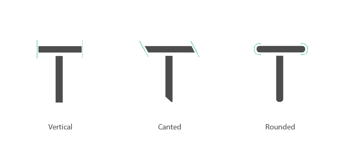
Horizontal Terminal (आडी, आडवी रेखान्त) is the shape in which the horizontal stroke of the typeface begins as well as terminates. The horizontal is not always faithful to the tool used; at times it is Vertical, a characteristic trait of the letterpress era where the horizontal terminals were cut in vertical shape so that they would fit and join more easily with each other. A Canted Terminal would have meant the creation of a cumbersome kern at the beginning and end of shiro-rekha for every letter. Decorative initials and terminals are also available in existing fonts. Letters such as च, घ, छ, क्त etc. possess internal Horizontal Terminals besides their shiro-rekhas.

Angular Terminal (तिरपा, तिरछी रेखान्त) is the nature in which the angular or curvilinear terminal of the font terminates. In handwritten or humanistic typeforms, the inherent angular or curvilinear strokes within in its letters will terminate in an Oblique fashion. They might not even show consistency in their visual forms throughout the letters. On the other hand, rationalist and at times geometric fonts need to by definition have distinctive terminal endings which either have Horizontal or Vertical End. E.g. CDAC-Prakash NID-Maha, Univers, Helvetica.
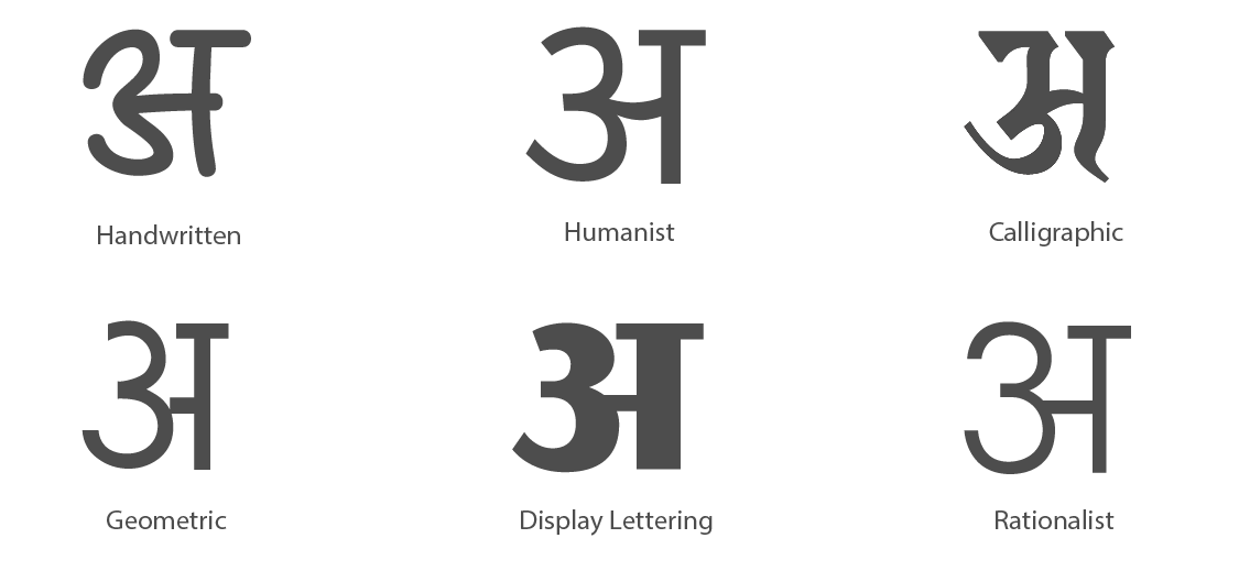
Basic Hand is the style/grammar or 'way of drawing/writing'. A commonly used Marathi term for this is the वळन or व्याकरण — the manner in which the strokes of the typeface are controlled by the type designer. It is difficult to come up with an objective classification and in many instances fonts follow more than one hand. We consider the stroke as an elementary unit of analysis, based on which we have identified six hands here. These are based on the natural versus constructed dichotomy; ranging from handwritten which representing the "natural/human" forms to geometric/rational forms which are "constructed" forms.
The Handwritten Hand(हस्तलिखित) which are the forms seen in letters, written by most people, is less regular than other styles. It rarely contains rationalised straight lines or perfect ovals or circles, instead preferring lines and base shapes which have several inconcinnities among the letters, which are easier and faster to write. Similarly, its aperture is wide and open, the curvilinear terminals are mostly oblique. In short, these fonts emulate the traits of a human handwriting used for everyday writings.
Deliberate Handwritten or Humanistic(सुविचारित), When the handwriting style is regularized and rationalized to a certain extent, and some of the intrinsic lines follow a strict horizontality and verticality. The circular shapes are much more deliberately drawn. This style is aimed at long text settings. The terminals are intrinsically standardized and there is a higher level of consistency in the shape primitives within the typeface.
Calligraphic hand (सुलेखन) is a stylistic variation, a combination of handwritten and deliberate writing with the specific intent of creating 'beautiful' letters. The notion of beauty here is mostly traditional. Most typefaces in this style have fluid and cursive flowing letters, with terminals that have a distinct direction to them. They largely mimic the scripts seen in ancient Hindu, Jain and Buddhist manuscripts, although in recent times several contemporary interpretations of calligraphic scripts can also be seen inspired from the Latin and Arabic schools. These typefaces are customarily used for setting small pieces of text in large sizes — in applications such as greeting cards and invitation cards, sometimes also used in text settings to set traditional religious texts— to simulate a manuscript like effect.
Beautiful letters which incorporate contemporary or recent aesthetics and are designed mainly for the purpose of large displays have been referred as Display or a Lettering Hand (अक्षरेखांकन, प्रदर्शन अक्षरे). Fonts with serifs, or which are overly bold or dark can be said to have a lettering hand; e.g. typefaces such as CDAC-Aakash and CDAC-Latika.
Rational Hand (तर्कसंगत) is where the type designer explicitly uses rational type design principles (many of which are seen in typefaces such as Helvetica, Univers, etc.), such as optical correction of circular curves, rational (vertical or horizontal) terminals etc. Examples of fonts using a rational hand in Devanagari include CDAC-Prakash (inspired by Helvetica) and NID-Maha (inspired by Univers).
The design of a Geometric Hand(भूमितीय, ज्यामितीय) is based on basic geometric forms, primarily the circle and square for Devanagari. This can be considered to be an extreme form of rationalization.
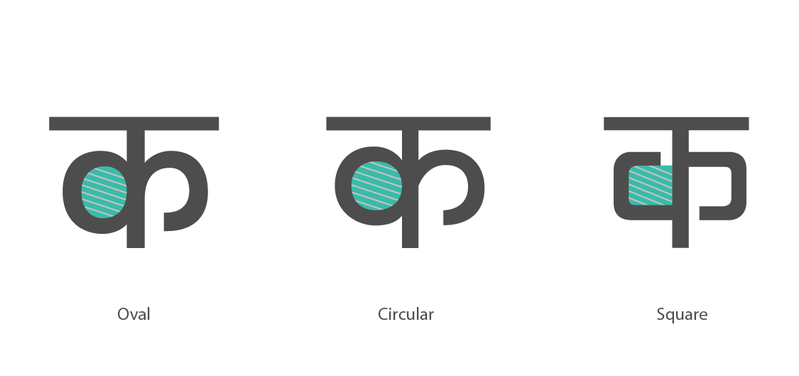
The Curve (वक्रता, घुमाव) is the treatment given to the curvilinear shapes throughout the font. Devanagari letters such as क, द, ठ, and most Matras are curvilinear in nature which can be treated in several ways, depending on the hand chosen, commonly seen approaches are Circular, Oval and Squarish.
A Geometric typeface has curves based on basic geometric shapes, predominantly circular curves. Rationalist or deliberate types of hands usually use oval curves. Display lettering hands viz. industrial or mechanized type of hands can have a squarish treatment for its curves, giving it a distinct appearance, as a large number of Devanagari letters have curvilinear forms in them. Triangular and other kinds of treatments have also been used, but the usage of such fonts is quite rare.
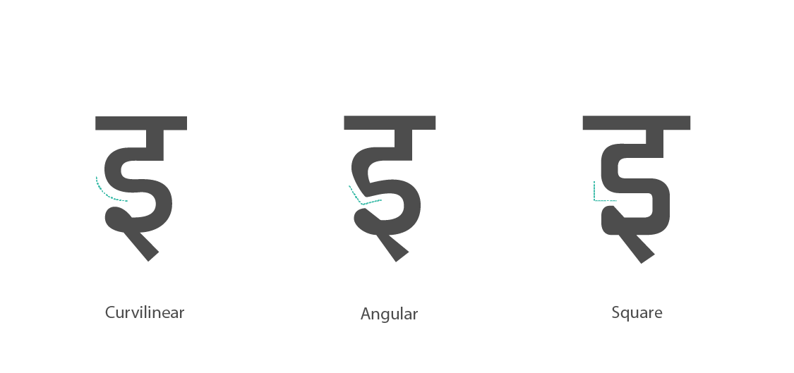
The Turn (मोड़, वळण) is the manner in which the horizontal stroke, connects or transitions into a curvilinear stroke in letters such as इ, ई, ङ, ड etc. These are easily identified by observing the transition between the horizontal stroke into the curvilinear form.Primarily three types of treatments are seen. Fonts which follow the handwritten hand will usually transition from the horizontal to the curve in a curvilinear fashion while fonts that follow a more deliberate hand might have angular turns. Display lettering typefaces from the mechanistic or industrial styles might transition in a squarish fashion which in effect becomes an angular turn with a ninety degree angle.
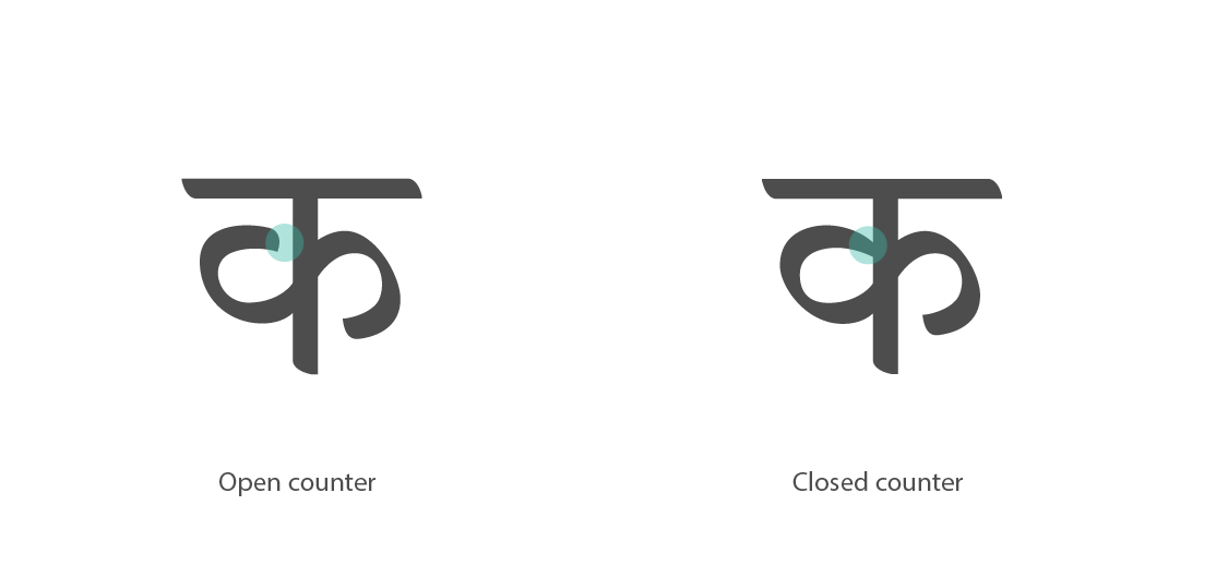
The Counter (विवर, पोकळ) is the negative/white space within letters. Broadly speaking, letters such as अ, उ, ऊ, ञ ट etc. have inherently open counters and letters घ, प, ष, ण, म etc. have closed counters. In this context however, we define a counter in a much narrower sense; we moderate the definition, of the negative space seen in the middle portion of letters such as क, व, ब etc. The two variations possible are: closed counters and open counters. Some readers associate Closed Center Counters especially in क as being Marathi, whereas the other possible variation, open center counters are associated with Hindi or north India.
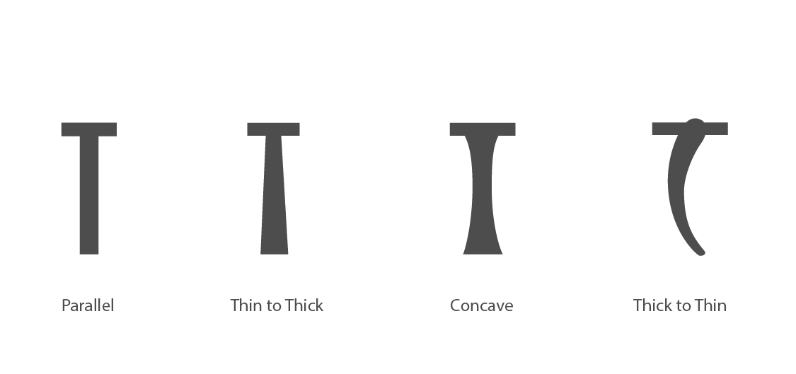
Vertical Stem (तना) (खोड) represents the vertical stroke of the font. It is one of the most recurring forms seen within a Devanagari script. Its façade depends both on the tool and the hand used. The variations include The Parallel Vertical Stroke, The Flared Vertical Stroke and the Convex or Concave Vertical Stroke. The Parallel Vertical Stroke is where both sides of the stroke run parallel to each other.The Flared Vertical Stroke is where the sides of the stroke diverge and the trunk expands from thin to thick. The Receding Vertical Stroke is where the sides converge and the trunk shrinks in width.Convex and concave trunks are seen in display/lettering hand and sometimes in calligraphic approaches to typefaces.
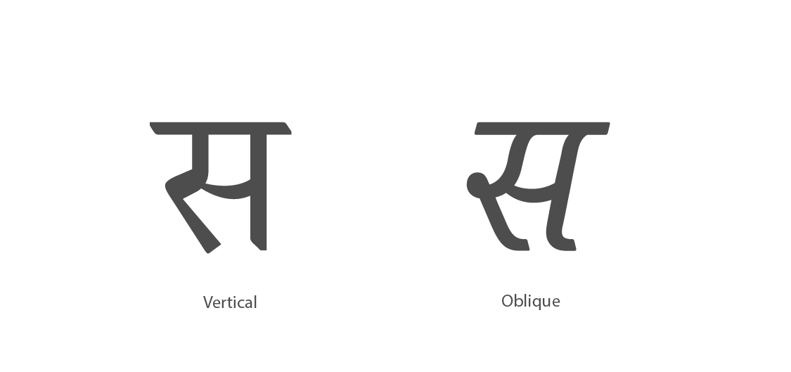
Inclination is the degree of deviation of letters have with respect to the referential vertical. Basically three inclinations are possible.Vertical, which is when the letters are upright i.e. the stem of the stroke is at a ninety degree angle to the shiro-rekha. This approach makes up for the majority of the existing typefaces. Handwritten and calligraphic fonts can be Inclined towards the right and can be called 'Slightly Right Inclined' or 'Overly Right Inclined' based on the degree of the slope of the incline; styles of the same font, i.e italics or more correctly cursives have a right inclination. There exists some reverse cursive typeface which are left inclined.
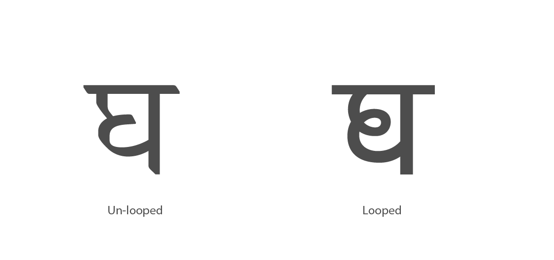
Curve to Curve Joinery is the manner in which a curvilinear stroke connects to another curvilinear stroke in letters such as अ, उ, ऊ, घ, छ, ध, द्य etc. One can say it is dependent on the 'hand', resulting in two types of Curve to Curve Joinery: Looped Joinery and Unlooped Joinery. Handwritten Curve to Curve Joinery mostly tends to be Looped, while other approaches such as Rational, Deliberate And Geometric tend to be Unlooped. Looped joinery is also seen in calligraphic and display lettering.

Neck (Peg) Joinery (गर्दन का जोड, गळ्याची/मानेची जोडनी) is the manner in which the Neck joins or transitions on to the succeeding stroke, in pegged letters such as ट, ठ, ढ, द etc. Broadly speaking, two approaches are possible: Angular neck joinery and Horizontal neck joinery. Angular neck joinery is seen in handwritten and calligraphic approaches to typefaces where the hand is relaxed and humane in nature. In most cases the angle is obtuse. In very rare cases the angle can be acute— the succeeding line traverses towards the shiro-rekha before beginning its curvilinear phase. The Horizontal neck joint is found mostly in deliberate and rationalistic typefaces.

The Knot is the nature in which one stroke overlaps over another and traverses ahead in letters such as म, इ, द etc. Within this visual feature, two location specific distinctions can be made, the Middle Knot (मध्य/मधली गाठ) and the (अंत्य गाठ) End Knot.
Middle Knots are seen in letters such as म, भ etc. Three variations are possible in the middle knot. The first is the Filled Knot (भरलेली गाठ/भरी गाँठ), where the overlapped strokes create a filled (black) knot at the overlap. Closed Knots are created when a white counter-space is created at the knot. The third is an Open Knot which is rarely seen in typefaces. It is mostly used for display and calligraphic typefaces.
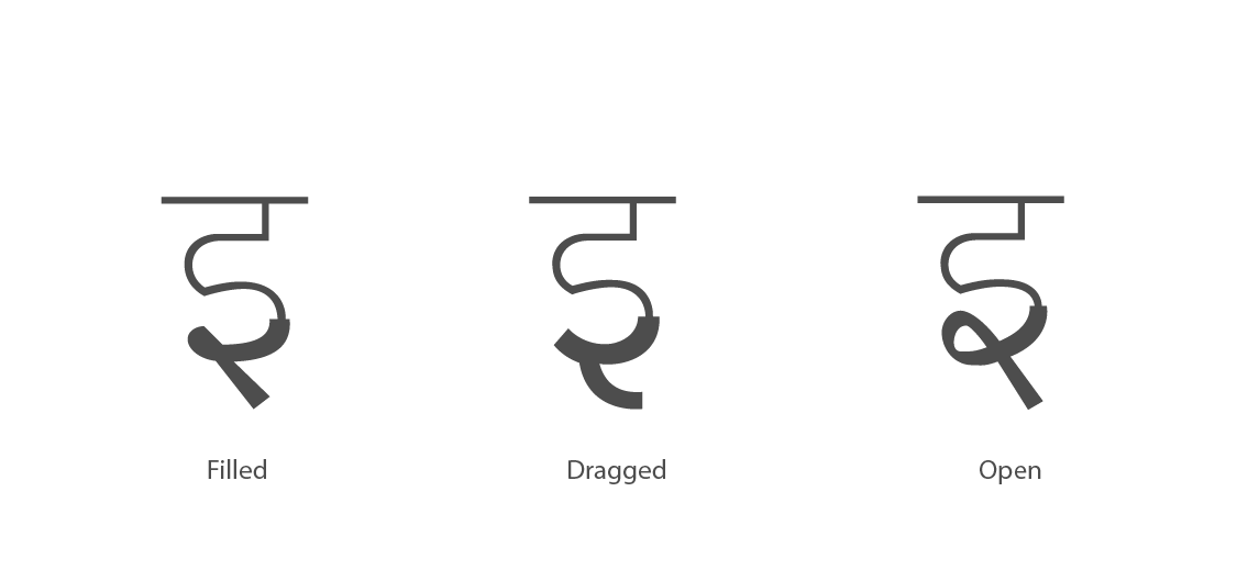
End (Terminal) Knots are seen in letters such as इ, द etc. In the End (Terminal) Knot the same three variations are possible, the Filled Knot, the Closed Knot and the Open Knot (उघडी गाठ/खुली गाँठ). Here for the open knot the term 'dragged knot' (घासलेली गाठ/घसीटी गाँठ) is also used to authentically represent the manner in which the knot is drawn.

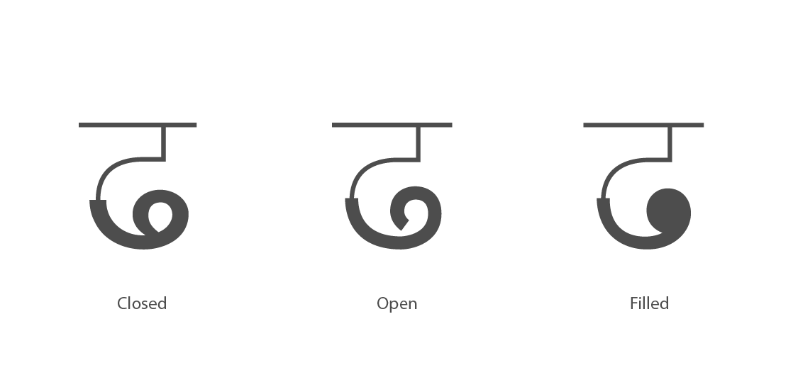
The Beginning Loop (सुरवातीचा/आरंभी फास) is defined as the nature of the initial portions of the letters such as ध, भ, श etc. Three treatment variations for loops are typically seen: Open Loops (उघडा फास) or Hooks (हुक) are created when the loop does not completely close and an open counter is created in the area that is enclosed by the loop. Structurally, certain styles of Devanagari inherently have open loops in the beginning. Characters of typefaces designed in the Calcutta style omit the open beginning loops.
The Closed Loop (बंद फास) Here the starting point of the stroke joins the traversing stroke to create a small closed counter space.
The Filled Loop (भरलेला फास) is used primarily for display/lettering typefaces.
The End Loop (अंत्य फास) is defined as the end portion of letters such as ढ. These three variations, Open Loops, Closed Loops and Filled Loops are also seen in the End Loop of letters, although in the case of an Open Loop at the end, one never sees an omission as the End Loop is a distinctive part of the letter.
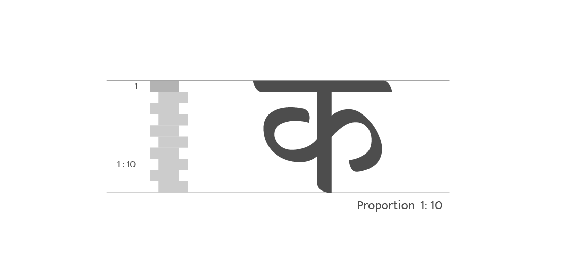
Internal Vertical Proportion is the ratio of the height of the shiro-rekha to the height of the kana height. Several authors have proposed ideal vertical proportions for the base letters, the range; height of the letter varies from 6 to 9 times (and even more) the height of the shiro-rekha. The base character proportion suggested by calligraphers such Maydeo, Palav and Kshirsagar is 1:6, this is usually very dark for a text typeface, but this might be because these recommendations are meant for calligraphy. Aryan recommends a 7×7 square grid for every letter, the vertical proportions seem agreeable for text typefaces, but force-fitting every character in a seven by seven square grid; somewhat analogous to Roman square capitals in Latin typography seems rigid and impractical for Devanagari. Gokhale and Saynekar suggest 1:8 as the basic proportion. The vertical proportion can be correlated to the weight and grey value of the typeface—this relation is best explained by Gokhale. He lists several measures of vertical proportions for various weights: 1:12 for extra-light, 1:10 for light, 1:9 for normal, 1:8 for medium, 1:7 for semi-bold, 1:6 for bold and 1:5 for extra-bold. These recommendations are intended for traditional text and calligraphic typefaces, in contemporary typefaces designerspractice a great deal of flexibility within these proportions.
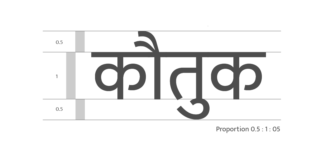
Vertical Matra Proportion is the ratio of the height of the upper Matra to the kana height to the height of the lower Matra. The recommended ratio is ½:1:½ for text typefaces in Marathi and Hindi; i.e. if the kana-height is eight strokes then the top and bottom Matras are four strokes. Calligraphic, Display and contemporary fonts vary these proportions considerably. In some cases the lower Matras are smaller in proportions than upper Matras because the stroke of upper Matra can be more complex than the lower Matra. An approximate rounded off nib-width ratio of the top most Matra is considered i.e the maxima of the ai( ै ), au( ौ ) Matras or the reph/rafar; for the lower Matras the lowermost line of the Ukar Matras( ु , ू ), or the Rukar is considered in approximate nib-widths or in proportion with the kana height.
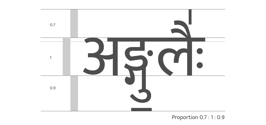
Vertical Total Proportion: The height of a Devanagari font is not completely defined by the vertical Matra proportions. Several key letters, glyphs, conjuncts, diacritical and vocalization and cantillation marks are required to make a complete typeface. Vedic manuscripts contain several complex vertically stacked conjuncts which are often combined with dependent vowel signs, vocalization and punctuation marks. Implementation of complex top Vedic Cantillation and tone marks, such as the वैदिक समस्वर अंक, possibly the tallest being the वैदिक स्वरित ऊर्ध्व शर combined with similar bottom tone marks with vertically stacked conjuncts can lead to an extremely large and highly complex six to eight tiered vertical grid. The total internal ratio is defined as the total vertical proportion for a given typeface (topmost glyph to kana height to lowermost glyph height). Here many times the amount of space allotted to the lower Marta of a conjunct is larger than that of the upper Matra.
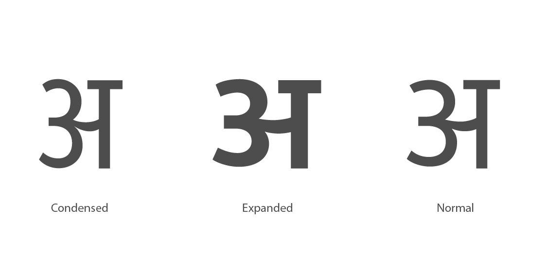
The Horizontal Proportion is the proportion of the width of the letters. Common among these are, condensed, regular/normal and expanded. Another method of evaluating the horizontal width for a length of a typeface—analogous to the AZ length in Latin typography is the AHO (अहो) length, first suggested by R.K. Joshi. The AHO length is an un-spaced string containing a select few high frequency syllables starting from अ to हो. The complete string is: अआउकाकिकुगघघाजजाटणततातूदननानिनेपप्रबभभाभीममामुमेंययायेरराललालिववाविशससाहहाहो. The length is measured by writing the above letters and measuring its length by any common scale. This length is particularly useful to compare the horizontal economy of space within typefaces.
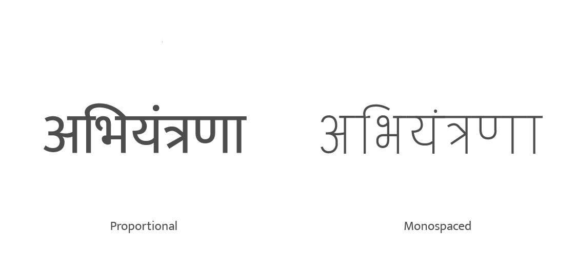
Glyph Widths are the width proportions of glyphs within a typeface. There are two types of widths: Fonts which have Varying or Proportional Widths for glyphs, and fonts with Mono-Spaced or Equal Width Glyphs. In current digital typeforms, only Proportional Glyphs are seen. Monospaced Fonts were quite common in pre-digital days of printing; typewriters, telex machines and some hot metal compositing machines used fixed-width glyph fonts. Their visual quality is inferior—since each glyph occupies the same amount of space, the Matras suffer the most; hence they are rarely seen in digital printing.
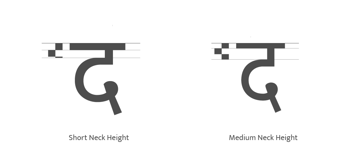
Neck / Peg Height (Position) is the height of the neck or peg of the letters, in comparison to that of the shiro-rekha (the width of the pen-tip). The neck height is measured from the end of the shiro-rekha to the end of the neck and can be visually gauged by observing all the pegged letterforms (इ, इ, द, ढ, ड, झ, ठ). This height is proportional to the grey value of the typeface—as the typeface becomes darker, the neck becomes smaller.