Design Case study
IIT Bombay Campus Map
Re-design of the Campus Map
by
Third Iteration
Slide - 1
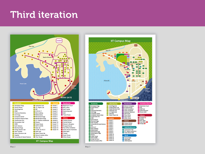
In the new iteration textures were brought in and the number of groups was increased.
Slide - 2
Slide - 3
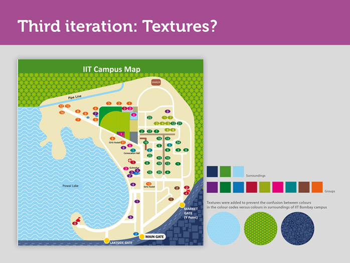
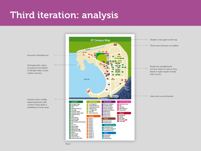
We had used solid flat colours in the legend as colour codes. At times these were confused with other shades of green and blue present in the surroundings. To prevent such confusion, we added textures.
Slide - 4
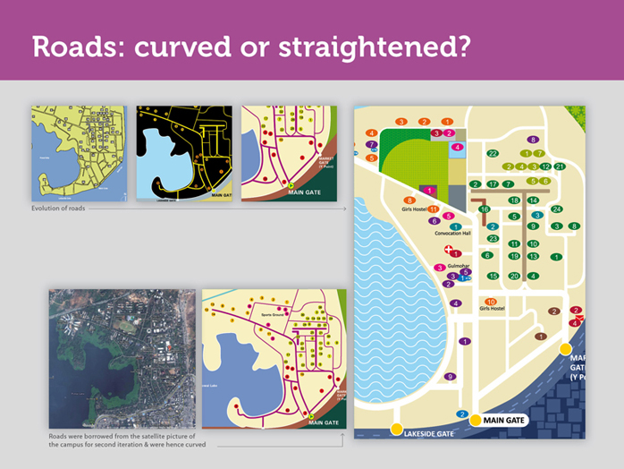
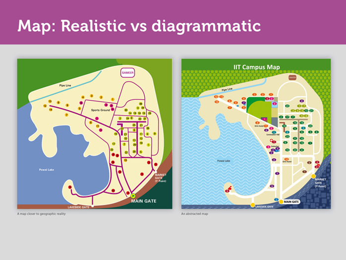
Earlier, roads were drawn from reference of a satellite image of IIT B campus, thus they appeared crooked in lot of places. But a pedestrian or a person driving on the road-will not have a bird’s eye view of the campus similar to the one provided by the satellite image. A road, might be geographically full of bends, but as long as a person, does not physically take a left or right turn while driving or walking, these bends in the road will not be felt and are an unnecessary information. In fact, they could cause confusion.
Hence, the campus roads in this map don’t follow the exact topological terrain, but are a diagrammatic representation of the IIT B campus. Also, the roads are now shown in white- reducing the intrusion that was caused earlier by the use of darker roads on a lighter cream background.
For example:
Imagine, if you ask people on the campus, how to go to Hostel 13 from the main gate, they would say keep walking straight. A person walking or driving down this road (from main gate to H13) will always perceive this road to be straight, despite of the curves you see in the satellite picture. This is where we use abstraction in the map. We will talk about abstraction in the next slide.
Slide - 5
Curves were removed from the roads, not to avoid confusion but to reduce cognitive load and make the map simpler.
What is cognitive load?
• Whenever you search for something; you process information, any information processing activity that the brain is put trough is termed as cognitive load.
• Reducing cognitive load is reducing the amount of information to be processed by the brain, so we decided to do away with curves.
This means, our map does not mimic reality anymore. Our map is diagrammatic. It’s abstracted. Abstraction means something imagined or pictured in the mind. Thus, our map is simpler to scan and easier to understand. We are trying to bring the diagrammatic representation of the map as close as possible to how people perceive in real life.
One note of caution:
Our map is not to scale. The distances do get skewed a bit in diagrammatic map, so we have to be extra careful.
For further reference of diagrammatic maps, refer to Beck’s map of the London Underground and Vignelli’s diagrammatic map of New York subway system.
Slide - 6
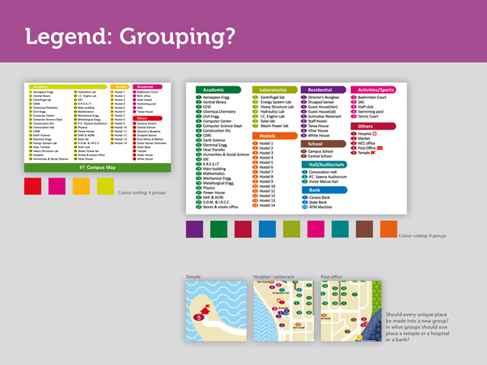
The number of groups in the legend increased for a reason. Let me explain.
- In what group would you put, say, a temple?
We created a group called others and placed the temple there.
- Another example, where would a garden lie?
Every campus is home to such unique places, are you going to make groups for each one of these? And, how is our user supposed to guess, what we have placed under what group?
Certain things like banks for example, cannot be put under ‘others’ because they are important. That is why we made four new groups - banks, schools, auditorium and extracurricular activities. Even now, there are places like market, medical shop, hospital which have no other group to go into and remain in ‘others’.
Slide - 7
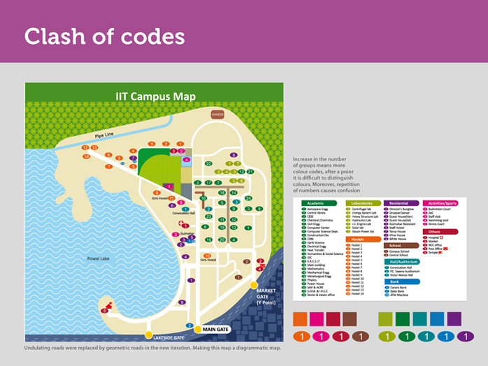
Even if the number of groups increased in the legend, things did not become easy for us. More groups meant more colour codes and under each group the numbering starts from 1.
Eventually, all the colour coded numbers start looking similar on the map. We struggled with this for a while and with increase in number of groups, we ran out of colours that could be easily differentiated by the human eye.
It was not under our control to manage the repetition of numbers either. You see, hospital is 1 and sports ground is also 1. We addressed this issue by removing the groups and arranging all the places alphabetically.