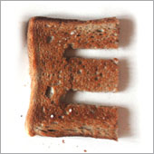
Let us look at letters, not just as abstract forms and carriers of meaning; but instead as real, physical shapes. If we treat these shapes creatively there is a possibility that we cease to only read them; we go on to understand the meaning depending on how they are arranged and the materials used for making them. As each of these qualities, add another dimension to the letter - the letter turns into an image. This can be called 'expressive typography'.
The 1960's saw a surge of 'expressive typography', where the type is physically modified to literally create/ illustrate a statement. Designers like Herb Lubalin NY
Massin from France and Otto Storch are well known for their practices in it. A simple word or line comes alive when treated expressively. A desire for doing 'something differently' amongst the designers according to Allen Hulburt is what initiated a new chain of works.
In 1964 Massimo Vignelli's XXXII Biennale Posterbroke new ground. Rather than setting or embossing the typography he went on to cut each character out of paper. Shadows were created with the irregular bending of the paper, and furthermore the poster was photographed, just the way a product would be, allowing the word to become an image.
Iconographic typography on the other hand is when letters are converted to illustrations. They have a strong graphical personality. Alphabets from 'Champ Fleury' by Geoffroy Tory is one of the earliest examples of iconographic text, where alphabets are created with shapes of tools, it is an example of how a typeface can be extended pictorially rather than being merely symbolic. Today a number of free font websites have decorative fonts like the ones shown below, which are created on the same principles.
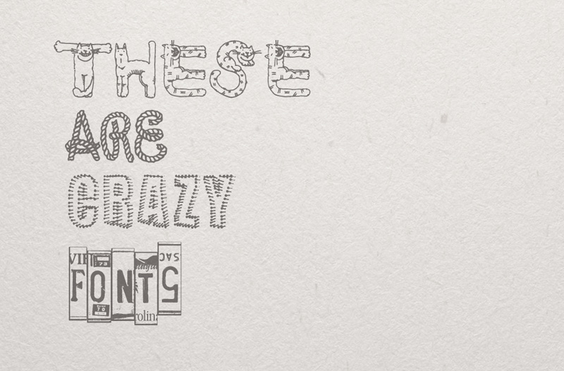
Cats Alphabet', 'Rope', 'Nailed' and 'LicensePlates' are some examples of free decorative fonts that can be found online at Dafont.com
Some of Google logos are good examples of how the font/ logo has become an image, and relating to it is so easy that even if all the letters are replaced with objects and images one can still read the word Google.
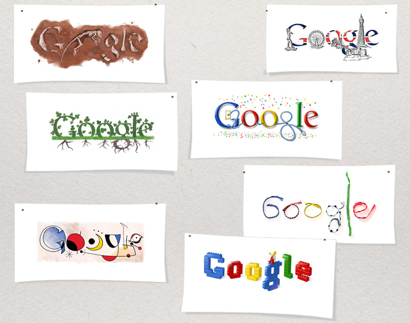
The Google logo depicting 'Ida' the missing-link fossil of Darwinius masillae that was discovered recently. Google - illustrated as London city. Google celebrating St. Patricks Day, Google logo commemorating the New Year, Google acknowledgment of Lego and finally Google tribute to legendary artist Joan Miro.
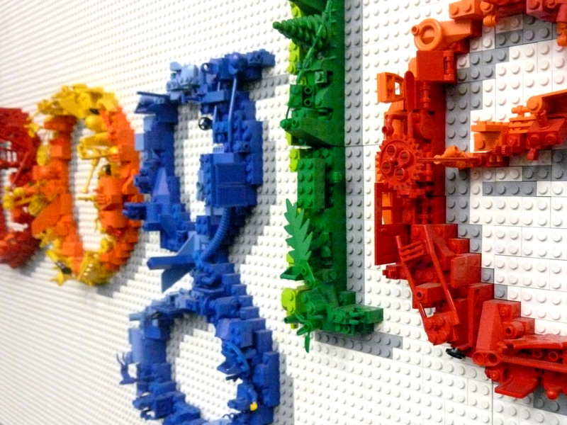
Google New York office has a gigantic logo made from Lego bricks, making the entire logo tangible and imparting the feeling of a literally 'constructed' type.
The images below are just suggestions to open up the different possibilities of our visual vocabulary. Communicating through words or images does not have to be staid, or purely functional it has to be practiced mindfully, creatively and respectfully. It is important to keep developing unique, untraditional work, taking inspiration from everything that surrounds us.
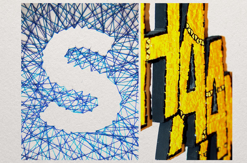
In the first image you can see the letter "S" which was created using pins and embroidery thread by artist Lauren Manning. The space outside of the character has been filled by winding and weaving two colours of thread around the pins. It is interesting to see how the negative space forms the letter form, with the positive space filled.
The second image is, the word 'Wham!' crafted in the byzantine mosaic technique by Barbara Liverani who likes combining ancient techniques with modernity.
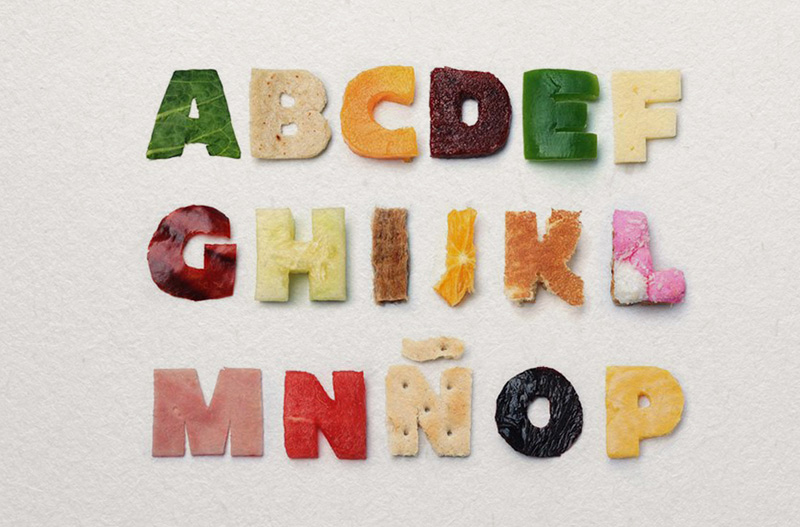
This is an factually edible font, it has been created by Funkadelic Type.
