As a communication designer, you are often involved in creating logos, where you create an interplay of elements in the "front" instead of in the "back." The elements in the front are known as the figure as they constitute an entity that you often identify. The elements in the back constitute the ground. Figure and ground appear in a variety of contexts in graphic design. Examples include famous logos such as the T (white figure, blue background) in the TATA logo designed by the British agency Wolff Olins.
Photographers often use the concept of positive space (figure) and negative space (ground) to denote this aspect. A very famous demonstration of this figure-ground distinction is obtained in the Japanese style of art called the Notan (light/shadow). Here, the negative space (ground) is sufficiently enclosed; thus, the viewer finds that the meaning changes based on the part that becomes the figure. The graphic symbol depicting the Taoist principles of yin and yang is an excellent example of a shift between light and dark.
Dynamic interaction in the field decides what becomes a unit, what is excluded from it, what is a figure, and what falls back as mere ground. – Wolfgang Kohler
Look at any landscape photograph. You see the shape of things, the mountains and trees and buildings, but not the sky. – Kurt Koffka
Perceptual segregation, or separating one item from another, was also a topic of concern to Gestalt psychologists. The problem of figure-ground segregation refers to the challenge of what causes perceptual segregation. When we view a distinct object, we usually see it as a figure that stands out against its background, referred to as the ground. For example, you might see a lamp on your bedside table as the figure and the tabletop as the ground. Or you may recognize the logo of our favourite masala cola on a billboard from afar. The logo (figure) stands out from the background. The critical challenge in this course is not only to recognize that figure-ground segregation occurs but how does it occur? Can designers use these segregation principles to design better?


Figure 3.1.a
Source: Sruthi Sridhar. Recreated from Goldstein, 2010 (page 108)
Properties of Figure-ground Separation
One way to understand the segregation principles is to explore figures like the one below. It was proposed by Danish psychologist Edgar Rubin in 1915. The picture below is called a "bistable figure.” It is bistable because you can switch between recognizing the faces and vases in a continually changing fashion. In other words, it can be seen as two yellow faces looking at each other in front of a black background or as a black vase on a yellow background, and this pattern is an example of a reversible figure-ground. There are three essential properties of figure and ground:
- In contrast to the ground, the figure is more "thing-like" and distinct. As a result, the vase looks like a memorable object when seen as a figure. However, when you see the black area as the ground, it does not appear to be an item and is forgettable.
- The figure appears to be standing in front of the ground. As a result, the vase seems to be in front of the yellow backdrop, whereas the faces look to be on top of the dark background (black) when seen as a figure.
- The ground appears to be made of unformed material and extends behind the figure.

Figure 3.1.b

Figure 3.1.c
Source: Sruthi Sridhar. Recreated from Goldstein, 2010 (page 108)
Figure-ground is fundamentally the visual relationship between the foreground and background of a picture or between the item and the space it occupies (positive negative space in photography terms). The term "figure-ground" literally refers to our capacity to distinguish between objects in our visual field based on contrasts like light and dark or black and white. We notice brightness, especially when contrasted with something dark or monotonous, and an essential, uncomplicated background helps us better understand the person or focal point of the artwork.
For example, look at the images below.
.


Figure 3.1.d
Source: Hemanth
When the image is made up of stripes that are all the same weight, it is difficult to distinguish between the ground and the figure since no cues are provided. It appears flat. However, when this uniformity of the stripes is broken, one can tell the difference between the figure and background, but the sense remains ambiguous. Some people see black stripes over white, while others see the opposite.
Effective figure-ground relationships occur when the viewer can easily recognize a figure as a unique item distinct from the composition's background—finding a balance between these components that works for your design and messaging is how one should handle figure-ground connections. Designers often work on an exquisite balance of figure-ground segregation when designing logos. The image below shows the possibilities of the interplay of figure and ground from a designer's sketchpad.


Figure 3.1.e
Source: Nidhin Joseph
How do people distinguish between figure and ground?
Our brain employs various strategies to distinguish between the figure and the ground. Some of them are listed below:
Blur: To show the distance between the viewer and the item, objects in the background may appear fuzzy or hazy, while those in the foreground are frequently more explicit images and more distinct. Photographers add this blurriness by focusing on the subject matter, thus making the figure stand out. In the figure below, the photographer explicitly blurred the background, using a filter on the phone, making the figure stand out.

Figure 3.1.f
Source: Vivek Kant
Separation: Any object that stands out from the surrounding visual features is more likely to be comprehended as a figure than as a background. For example, in the example below, because we are used to seeing faces, we would assume the darker portions to be the face and everything else to be the background. Similarly, because we are well acquainted with the alphabet shapes, we consider the darker areas to be the foreground and the lighter areas to be the background.

Figure 3.1.g

Figure 3.1.h
Source: Hemanth
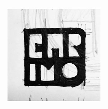
Contrast: High contrast between design cues can make it easier to tell a figure from its background. In the image below, the letters CARIMO are in high contrast from the background.


Figure 3.1.i
Source: Nidhin Joseph
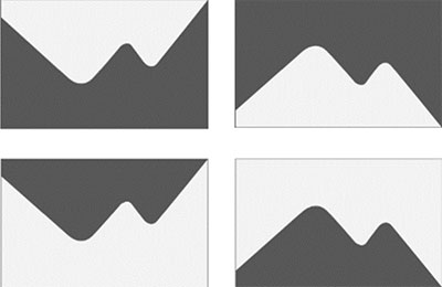
Similarly, in the picture below, there is a high contrast between the two elements in the image. Therefore, we perceive the lighter area as a "mountain" and the darker area as the background.


Figure 3.1.j
Source: Hemanth

Figure 3.1.k
Source: Vivek Kant
Size: On a 2D plane, where visual depth relies on deceiving the eye, our brains are built to interpret larger objects as being closer and smaller items as further away. Graphic designers working on the 2D plane will benefit from the idea when designing posters which do not have depth cues. In the above example, the lower-level letters appear further in the distance from the characters in the top line due to the size difference.

Figure 3.1.l
Source: Nidhin Joseph
Different Types of Figure-ground Relationships
Simple figure-ground: A simple figure-ground interaction is produced when coherent, independent objects are placed next to each other in an area that serves as the surrounding ground. These compositions always have a negative and passive foundation and positive and active figures. Simple figure-ground interactions make figures distinct from the background and easily recognizable.
Figure-ground reversal. Figure-ground reversals occur when the ground becomes the figure while the figure becomes the ground and comes into focus. Shapes that emerge in the gaps between the figure's components invert these roles. Figure-ground reversals bind and restrict images, while simple figure-ground compositions give the impression that limits are endless. The best example of this is the hidden text illusion.
Ambiguous figure-ground. These types of figure-ground examples exist between the two types mentioned above. When the visual relationships between the composition's object and space are challenging to discern but completely understandable, ambiguous figure-grounds are produced. Typically, items in this type of figure-ground connection have the same edge or contour. Edgar Rubin's vase is a well-known illustration of ambiguous figure-ground interactions. In this classic image, two positive black spaces are used to create human facial profiles, while the positive inverse spaces are used to create a vase. The ambiguity of the object and background leaves room for the viewer's interpretation.
Along with the ambiguity of the figure and ground, the contours in between also hold significance for typographers. This is often seen in the case of ligatures in typography (e.g., the ligature Æ with a common contour). Another example of the playful use of a contour can be seen when an image shares a common contour - this results in an illusion.


Figure 3.1.m
Source: Shraddha Prabhu
The above issues are explained for figure-ground segregation more generically. It is future explored in terms of two phenomena of figure-ground reversal using typography and camouflage principles developed by artists.

